Every AI Video Delivery Comes With a Drawing
A client once said the pipeline drawing I sent them "made it click" faster than the three pages of notes that came before it. That stuck. Every delivery since has come with a diagram, and somewhere along the way the diagrams stopped being throwaway and became a product of their own.
The repo I just published is that product: AIVideoDiagrams, fourteen diagram types on one design system, all of them plain SVG that open by double-click.
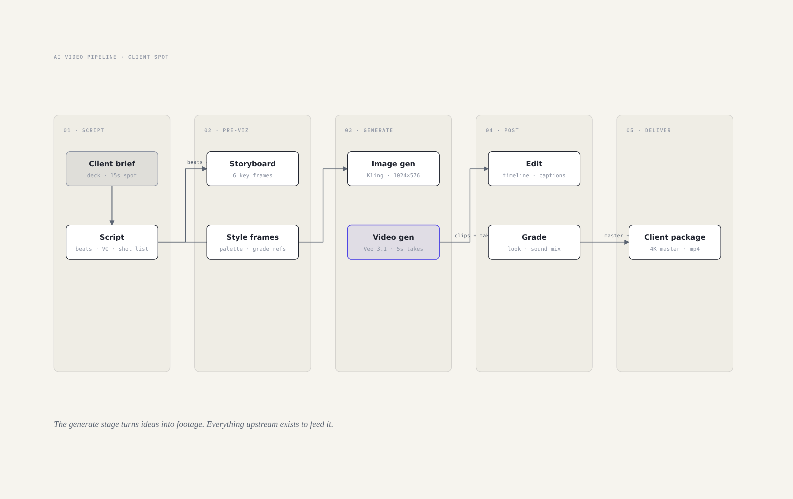
Why diagrams, why now
AI video work is hard to talk about because most of it happens inside a prompt and a model you cannot see. A client approves a look they can barely describe and a pipeline they have never watched run. A drawing fixes that. It gives both of us the same map, and arguments about the map happen on paper instead of in a Telegram thread at 11pm.
The other reason is my own consistency. I used to draw each diagram the way I felt that day. Three different styles in one folder, and none of them looked like they came from the same studio. So I did what I do with prompts: I locked a system.
The system, briefly
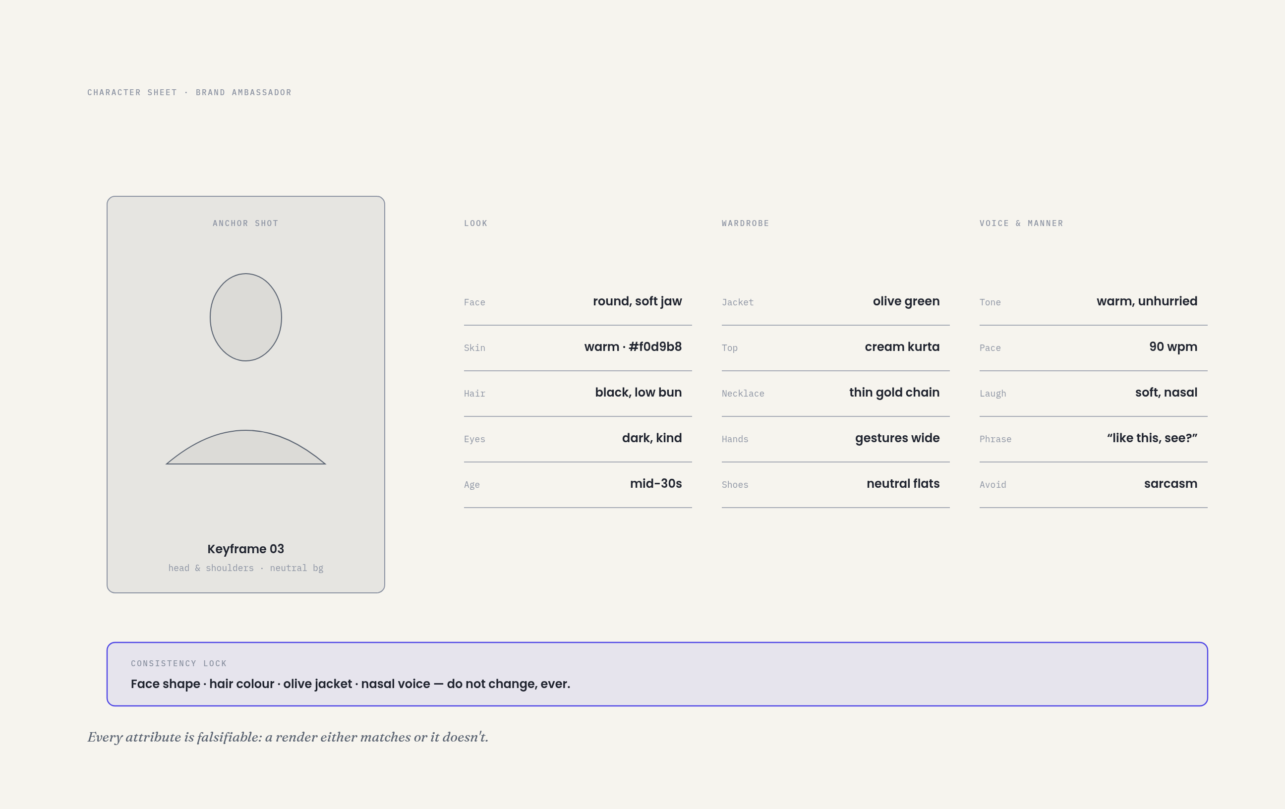
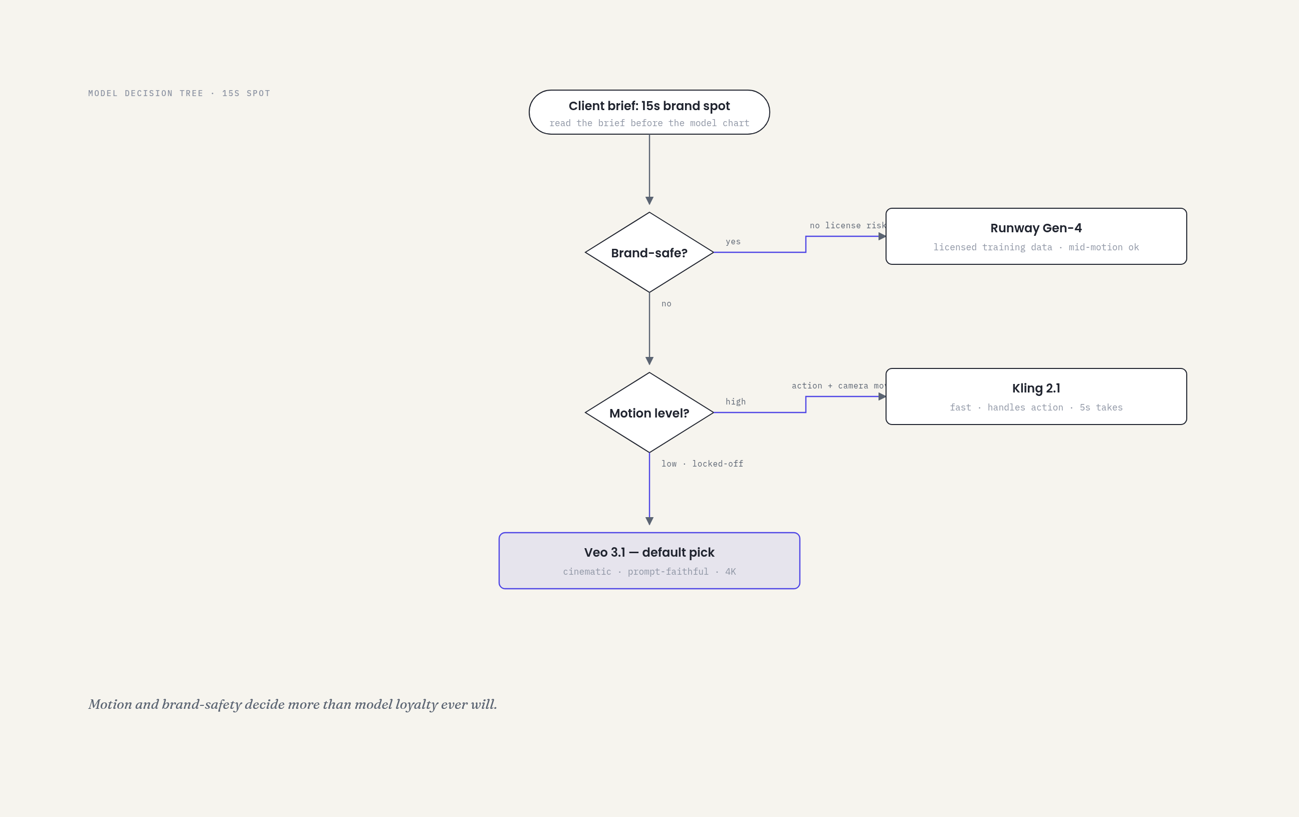
Fourteen types cover everything a client project needs. A pipeline for the flow, a decision tree for picking the model, a character sheet for the person on screen, a style board for how the footage feels, a sequence for how the automation talks to the APIs, an architecture for how the studio is wired. Down to the funnel that shows which concepts survived.
Every diagram shares:
- Three typefaces. Fraunces for display, Poppins for labels, IBM Plex Mono for numbers and timecodes.
- Eleven colour tokens in one
:rootblock. Change the token, every diagram in the folder changes with it. - One radius for nodes, one for containers, one arrowhead style.
- A single focal node. Exactly one element per diagram gets the accent treatment: the thing the client must look at first. If I cannot name it, the diagram is not done.
Density sits around 4 out of 10 on purpose. Empty space is load bearing. A diagram that shows everything shows nothing.
What the research changed
Before building this I studied diagram systems the way I study model documentation. The reference I kept coming back to was a consultant's diagram library: same rules everywhere, examples for every type, layout conventions written down per type instead of living in someone's head. That last part is what I copied hardest.
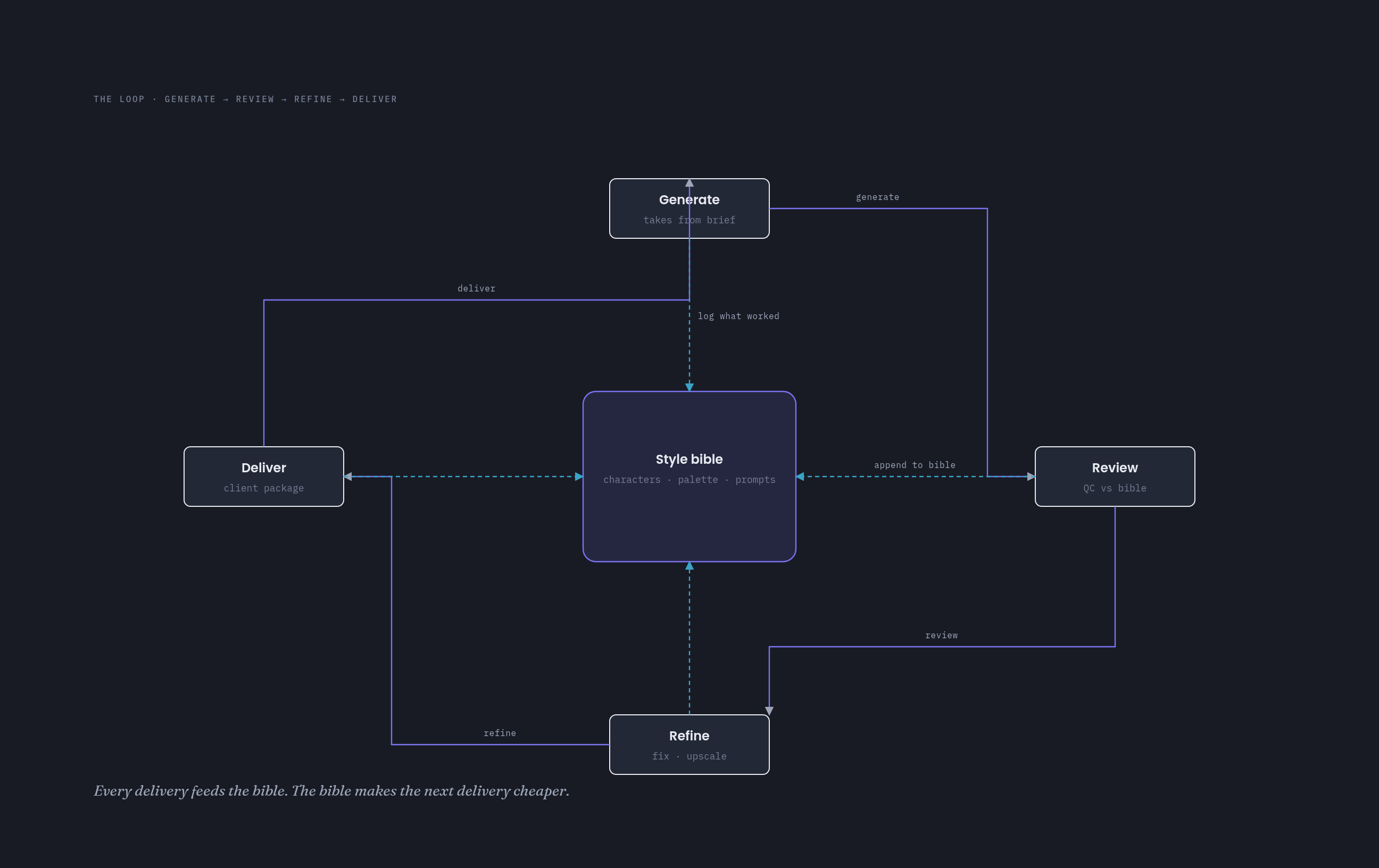
Every type in this repo has a reference doc. The state machine page says a render job lifecycle needs five to eight states and both a failure and an exit. The timeline page says events go below the baseline and phases go above it. The loop page says four stations max. When the layout rules are written down, the automation can follow them too, which means I can hand a blank template to an agent and get something that still looks designed.
The part I am proudest of
Dark mode is not hand tuned. It is generated. Each diagram ships light and dark, and the dark version is produced by a script that swaps the colour tokens. Twenty-eight files from fourteen sources, and they cannot drift from each other because there is no second version to maintain.
Every diagram also runs through a review gate before it ships. The gate checks the mechanical things a tired brain forgets: exactly one focal node, an aria label on the SVG, a dark variant that is newer than its source. The taste check stays human. I open the PNG and look at it the way a client would. Fine on both counts is the bar.
What this means for a client
Shorter meetings. When the map exists, nobody argues about what the pipeline does, they argue about what it should do, which is the actual work. My recent projects moved from "explain the process" to "here is the design, what do we change" in one exchange.
The diagrams also survive the project. The architecture drawing from month one is still the diagram I open in month three when something breaks. Nobody redraws it because it was made to be reused, not to be pretty once.
One honest note: the examples use real model names (Kling, Veo, Runway) because naming the actual tools is what makes a decision tree useful. Model lineups change faster than the diagram rules. The rules are the part that lasts.
If you run an AI video studio, or you just order a lot of AI video, stealing the naming and the token system is the whole trick. The rules were made to be stolen.
The repo is here: AIVideoDiagrams on GitHub.
If you want a diagram system like this wired into your own client process, book a quick call.
Have a project like this in mind?
I help brands and teams turn ideas into finished, living work. If something here sparked an idea, let's talk.